I'm not sure how this could actually be an instructive blog entry for anyone, but my hope was that it'd at least be moderately entertaining. Admittedly, reddit hasn't changed much since we started it 18 months ago -- excluding random logo doodles -- but it has changed nonetheless.
I can't help but wonder what Pierre Francois would have to say about this.
Oh well, come and laugh along with us...
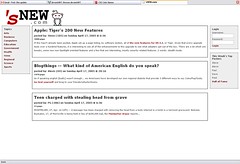
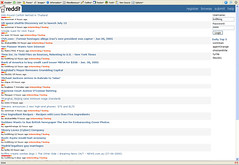
This was just a static html page so we could play around with the css. It was the first version of what would become reddit. Back then, it was called snew, as in "what's new". We'd have used snew.com as our domain name, but the owner is
apparently using it for other things (?).
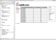
We switched to something a bit less conventional for a "news site", since we weren't trying to build a traditional news website. The alien was still in its infancy -- I wanted it to be even bigger. Steve said no.
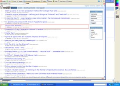
This was the first version of reddit that was actually online. This screen capture is dated
June 23, 2005. I can only imagine what those first users were thinking...
Actually, I know what they were thinking because they were all friends and family of ours. Frankly, most were probably wondering why there wasn't a mascot on the site.
Most of our early design scribblings happened in PaintShopPro 5. It was a shareware copy and yes, I was on a PC running WindowsXP at the time. This was a late-night idea for the user profile before we even had user profiles (or users, for that matter).
July 1, 2005: Thanks,
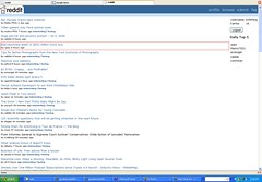
byrneseyeview. I'd forgotten about this one I'd uploaded a little while back. I believe the yellow bar indicated 'hotness' and the orange-red bar indicated total score. If you remember when reddit looked like this, you are truly l33t.
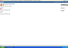
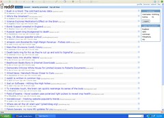
July 2, 2005: The bars have been vanquished! We've arrived at a layout that's pretty similar to the reddit of today -- a list of links and lots of whitespace. But where are the sort options?
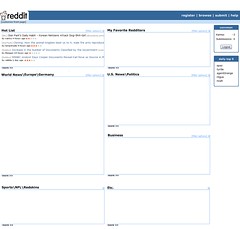
A friend of ours from school, Connor, had suggested a few layout ideas, including this newspaper-esque layout. At the time, there'd been a great deal of discussion about whether or not we should have topics and if we did have them, how they should be created and organized.
As you can tell, we didn't listen to Connor, but to his credit, he's still our friend.
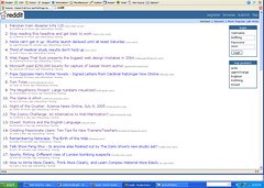
July 13, 2005: Still had interesting/boring links for voting and the new sort options are relegated over to the far right (squint, you'll see them).
July 14, 2005: The sort options were quickly relocated and we'd added arrows to 'boost' the story. We demoed this version to the other YC startups and I'll never forget the sage feedback we received. "More head and less shaft" (regarding the arrows, of course).
July 27, 2005: The RTM button! (If you know what that is, thanks, you've been a loyal user for way too long) This was a precursor to the [hide] button.
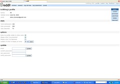
August 10, 2005: Here's what our first profile page looked like. See how long it takes you to find the profile buttons...
September 17, 2005: Starting to look familiar now, but look carefully, there are faint circles around each arrow (wtf?).
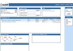
October 22, 2005: We eventually changed the [recommend] button to [share] since it wasn't quite clear what recommend meant -- especially once we turned on the recommended page. The names of the sort buttons got truncated and [top submitters] grew to a broader [stats] page, but those un-rounded buttons have stood for the last year.
Granted, there are certainly improvements we'd still like to make to the reddit UI and overall design, but we'd like to think we've made some progress.
I know my biggest regret is giving in to a 120x40 pixel logo. But these sacrifices make us better people, or so I'm told.
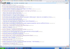
And here's a bonus image!
We weren't
always on the best of terms with the alien...


